My Role
Lead Product Designer — UX Research, Interaction Design, Visual Design, Usability Testing
Timeline
Phased rollout
Pilot in 2022
Soft Launch in 2023
Overview
Established in 2015, Maple is a leading Canadian telehealth platform that has significantly simplified access to medical professionals online for over a million users nationwide. Facing a 40% reduction in public healthcare reimbursements and a rapidly expanding telehealth market, Maple launched the "Maple Membership" project to transition from a transaction-based revenue model to a subscription-based one. This strategic shift was designed to ensure stable, recurring monthly income and to enhance user engagement by providing continuous health support. The project was rolled out in two phases: a pilot phase that focused on building subscription model and subscription related flows, followed by a soft launch that extended the subscription model to all users in Ontario, aiming to optimize conversion rates and adjust features based on continuous feedback. This approach not only responded to regulatory challenges but also aimed to stabilize Maple’s financial outlook and improve the overall user experience.
Highlights
Successfully spearheaded design the 'Maple Membership' rollout, achieving ██████* newly subscribed users and a transformative shift towards sustainable monthly revenue within the first year.
This has been redacted on this public case study for privacy reasons*
The Problem
Maple faced a significant challenge as regulatory changes reduced public healthcare reimbursements by 40%, leading to decreased physician participation and longer wait times for users. This reduction directly impacted Maple’s B2C revenue, necessitating a strategic pivot during a period of financial pressure. Concurrently, market research indicated a clear demand for a subscription-based telehealth model in Canada. Additionally, the need to enhance user engagement was evident, as interactions with Maple’s platform were predominantly transactional and did not encourage regular, ongoing user interaction. The project aimed to transform the revenue model from transaction-based to subscription-based, ensuring financial stability, reducing wait times, and fostering greater user engagement.
Problem Statement
Phase 1: Pilot
Objective
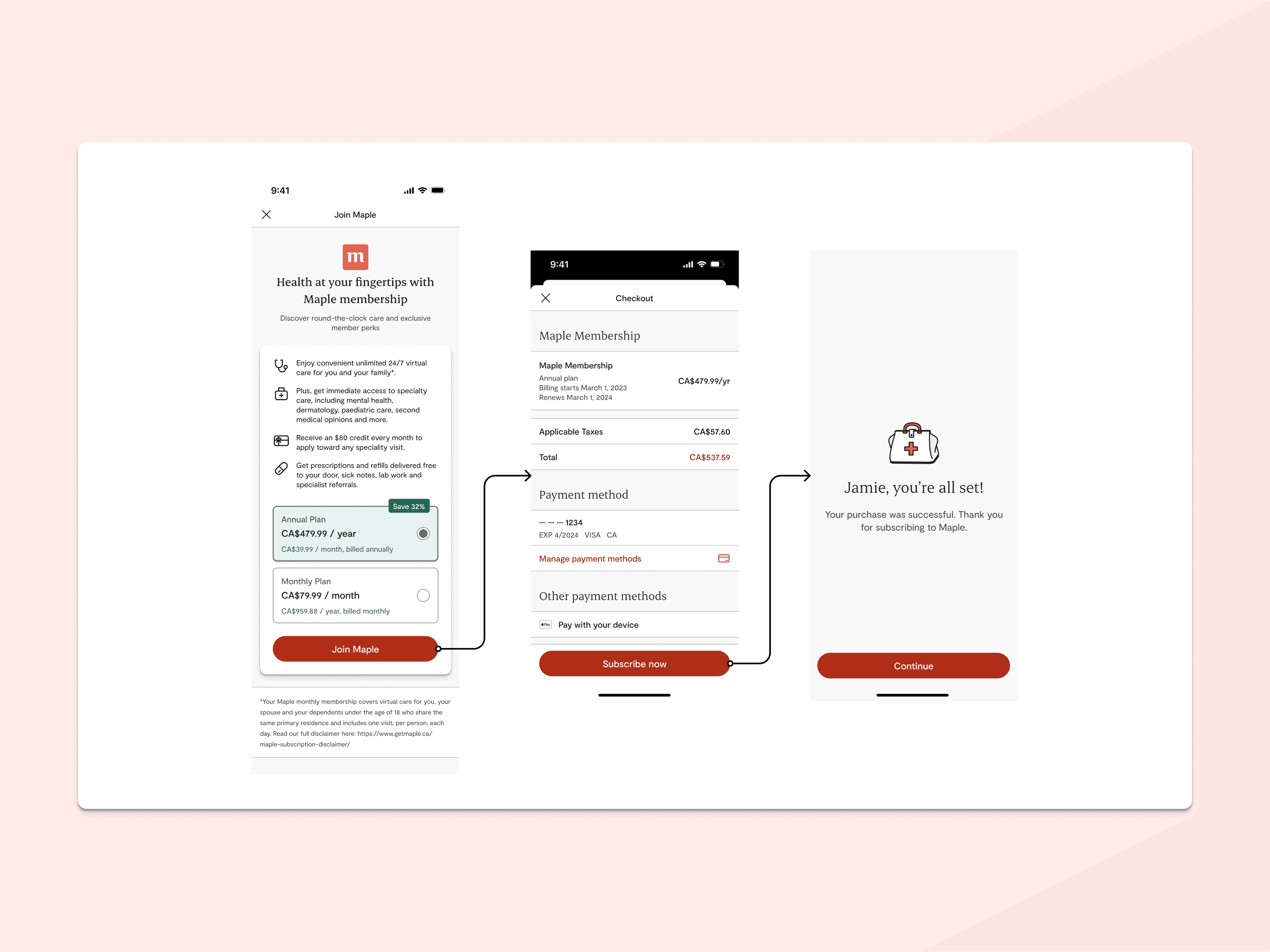
The pilot phase aimed to establish core functionalities for the Maple Membership subscription model, supporting marketing and external consultant efforts to identify and define key features of the Maple Membership, as well the pricing model. This phase focused on developing and integrating necessary features and flows to effectively implement the new subscription model.
Activities
Activities included auditing existing app touchpoints, reviewing a previously sunsetted legacy membership program for integration opportunities, conducting a market audit and SWOT analysis of existing subscription models, and designing new user flows and screens. These elements were then refined through usability testing prior to implementation.
Challenges
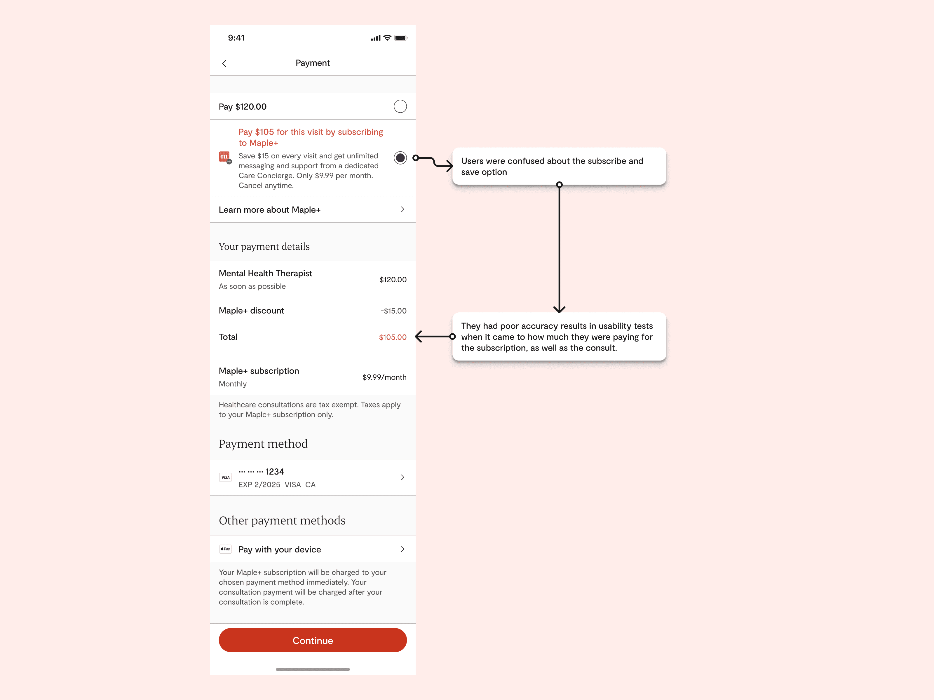
The phase faced challenges such as users not understanding why consultation fees were still applicable despite subscribing, which led to ongoing revisions of the subscription model.
An additional challenge was upon the creation of a single payment page combined subscription sign-ups payment and and reduced consultation fee payments was particularly confusing. This issue necessitated further usability testing and interface adjustments in the phase 2 (Figure 2.2).
Outcomes
The outcomes of Phase 1 were significant, culminating in the successful launch of the Maple Membership subscription and subscription related features. Through this phase, we gained valuable insights into the subscription model's cost structure and identified key usability challenges. These findings not only informed the enhancements made in the subsequent soft launch phase but also established a robust foundation for expanding the subscription model effectively, ensuring readiness for a broader user base.
Phase 2: Soft launch
Objective
The primary goal of the soft launch phase was to expand a refined subscription model to all users in Ontario, aiming to optimize the model's conversion rates and enhance overall user experience based on insights gathered from the pilot phase. In this phase, we also planned to launch identity and health card verification for subscribed users. These features allowed subscribed users to access public healthcare funds for their consultations.
Activities
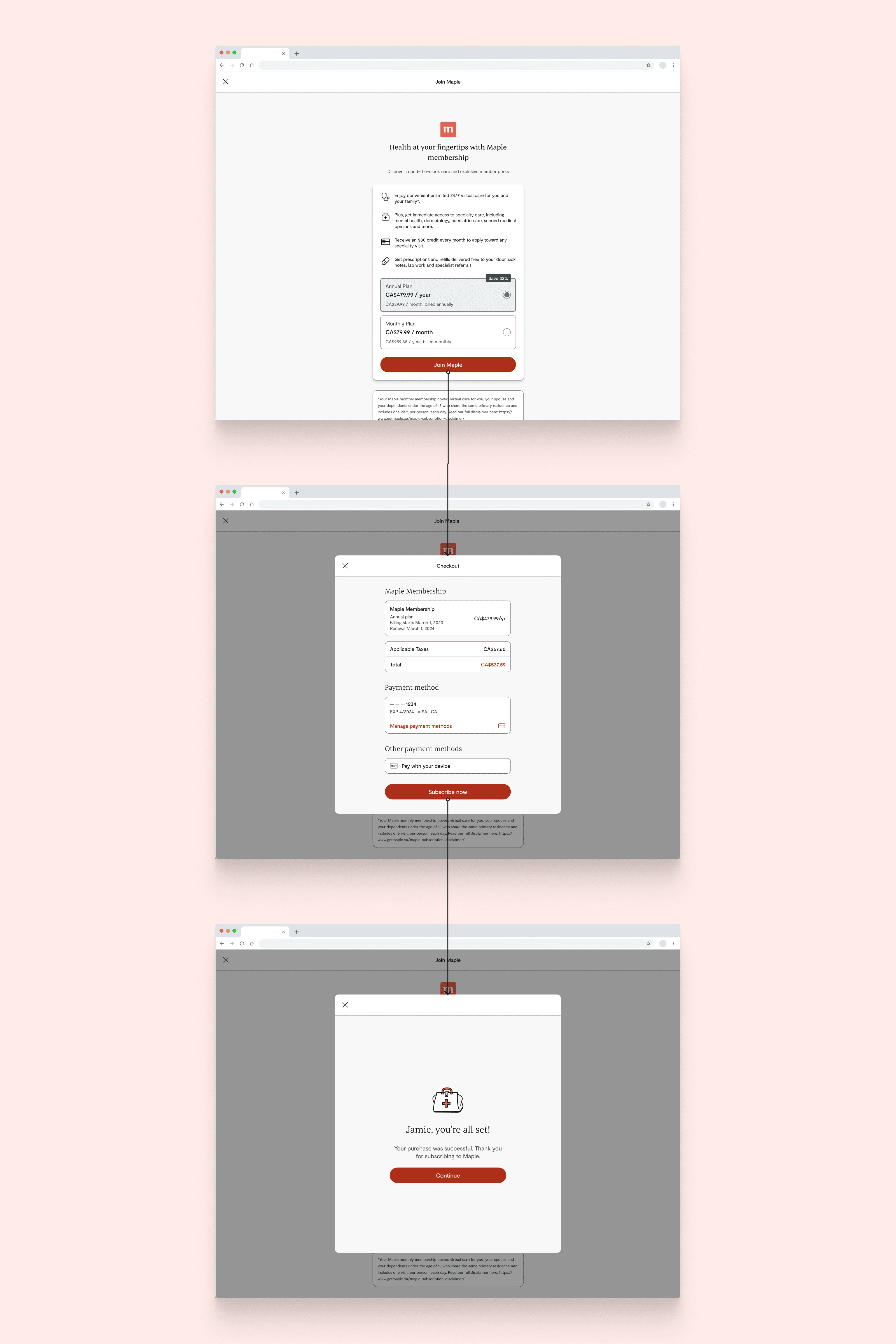
In Phase 2, we executed a comprehensive rollout of the Maple Membership subscription model across Ontario. This phase not only involved expanding the subscription service to all users but also implementing enhanced user experience flows that addressed the issues identified in Phase 1. Key activities included integrating ID and health card verification features to streamline access to public healthcare funds for subscribed users. We also continued to refine the user interface and interaction processes based on ongoing feedback to ensure a seamless user experience.
Challenges and Outcomes
As the soft launch of the Maple Membership subscription model in Ontario is still ongoing, specific outcomes are yet to be determined. Currently, we are monitoring key metrics such as user engagement, subscription conversion rates, and user satisfaction. These indicators will help refine our services and prepare for potential expansion. Expected benefits include higher subscription rates, improved revenue stability, and enhanced user experiences, setting a foundation for broader success.
Challenges & Retrospective
Advocating for my decisions
One personal challenge I faced was not standing firm on my UX design insights in discussions with influential non-UX stakeholders. I compromised on the UX flow they preferred, even though I had reservations about its effectiveness. This decision led to less-than-ideal outcomes, teaching me a valuable lesson about the importance of assertively communicating and defending my professional expertise to ensure the product's success.
Bridging the Gap Between Product and Marketing
A personal challenge I faced involved the disconnect between our product and marketing teams. As new members joined the marketing team, they designed subscription plans in isolation, which led to UX complications due to a complex pricing structure. Reflecting on this, I regret not being more proactive in fostering collaboration and communication. This situation taught me the critical importance of stepping up early to bridge gaps and ensure our team efforts are aligned, preventing foreseeable issues.


